
Guide to choosing a monitor for graphic design
Introduction
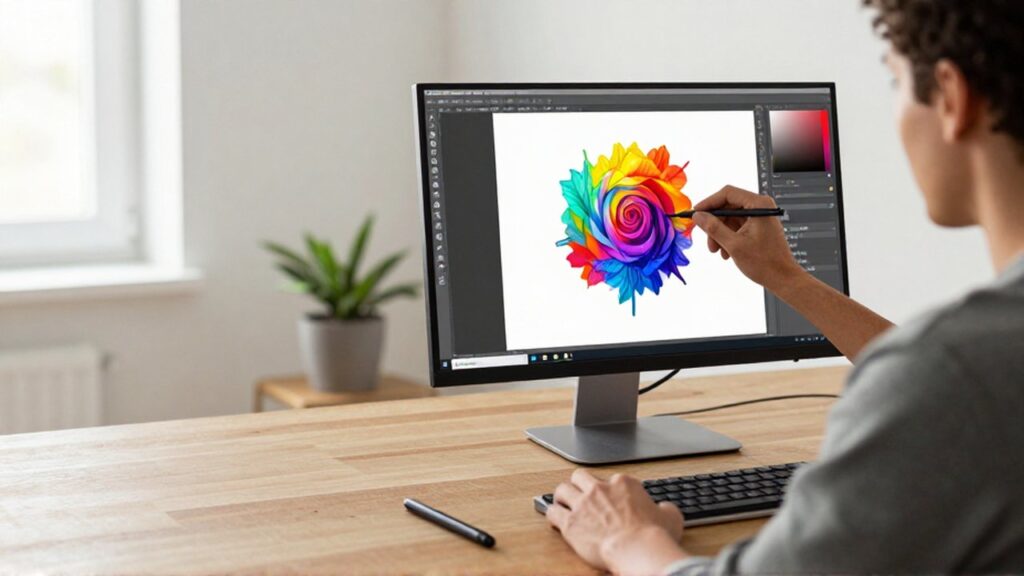
Choosing the right monitor is one of the most critical decisions for any graphic designer. Unlike general office work or gaming, visual design requires a display that provides absolute precision in how colors, shapes, and details are rendered. A monitor serves as your primary window into your creative work; if that window is distorted by incorrect color reproduction or poor resolution, your final printed or digital products will suffer from unexpected inconsistencies.
Selecting a professional-grade display is appropriate when you transition from hobbyist tasks to professional branding, photo editing, or digital illustration. A high-quality monitor ensures that what you see on your screen matches the reality of the final output, saving time and resources by reducing the need for constant revisions. Understanding the technical specifications of a display is essential to making a smart investment that supports long-term productivity.
Importance of color accuracy and gamut
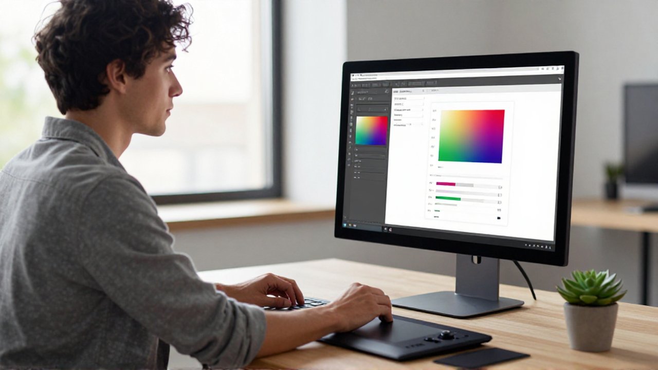
For a graphic designer, color accuracy is the most vital specification. Color accuracy refers to a monitor's ability to display colors exactly as they are intended to be seen, without unintended shifts in hue or saturation. If a monitor lacks accuracy, a bright red designed on your screen might appear dull or orange when printed, leading to professional errors.
The color gamut defines the range of colors a monitor can produce. When shopping, look for monitors that cover a high percentage of standard color spaces. Common color spaces include:
- sRGB: The standard for web design and digital content. Most monitors cover this, but for professional work, you want near 100% coverage.
- Adobe RGB: A wider gamut designed for professional printing and photography. It includes more shades of green and cyan than sRGB.
- DCI-P3: A color space used primarily in the film and video industry, important for designers working with motion graphics.
A designer should prioritize a monitor that specifically mentions high coverage of these gamuts to ensure visual consistency across different media.
Resolution and screen size considerations

Resolution determines the level of detail and sharpness visible on the screen. In graphic design, a higher resolution allows you to see fine lines, textures, and small typography without pixelation. Choosing a resolution that is too low can lead to eye strain as you struggle to discern details, and it also limits your workspace efficiency.
The relationship between screen size and resolution is key to "pixel density." A 27-inch monitor with a 4K resolution provides much sharper images than a 27-inch monitor with only 1080p resolution. For most professional workflows, the following standards are recommended:
| Screen Size | Recommended Resolution | Primary Use Case |
|---|---|---|
| 24 inches | 1080p or 1440p | Small workspaces or secondary displays |
| 27 inches | 1440p or 4K | The standard for versatile design work |
| 32 inches or more | 4K | High-end photography and detailed illustration |
While larger screens offer more "digital real estate" to keep multiple toolbars open, ensure the resolution is high enough to maintain sharpness at that size.
Panel technology and viewing angles
Not all monitor panels are created equal. The technology used to create the image significantly impacts how colors look from different angles and how much contrast you can achieve.
IPS (In-Plane Switching) panels are the industry standard for graphic designers. IPS technology offers superior color accuracy and wide viewing angles, meaning the colors do not shift or wash out if you move your head slightly to the side. This consistency is crucial when collaborating or showing work to others.
Other panel types, such as TN (Twisted Nematic) or VA (Vertical Alignment), are generally not recommended for professional design. TN panels are often faster for gaming but have poor color reproduction and narrow viewing angles. VA panels offer better contrast than IPS but can suffer from color shifts when viewed from the side, making them less reliable for precise color grading.
Contrast ratio and brightness levels
Contrast ratio refers to the difference between the brightest white and the darkest black a monitor can produce. A higher contrast ratio allows for more depth in images, making shadows look richer and highlights look more defined. This is particularly important for designers working with photography or complex lighting in digital art.
Brightness, measured in nits, is also a factor to consider. While very high brightness is necessary for HDR (High Dynamic Range) content, a designer needs a monitor that is bright enough to be legible in a well-lit studio but also capable of being dimmed for color-critical work in controlled lighting environments. A monitor that is too dim may force you to increase your software brightness, leading to incorrect color perceptions.
Common mistakes when purchasing a monitor
One of the most frequent mistakes is prioritizing gaming features over color accuracy. Features like ultra-high refresh rates (e.g., 144Hz or 240Hz) are excellent for smooth motion in games but are often secondary to color depth and gamut coverage for designers. A designer will get more value from a 60Hz IPS monitor with high color accuracy than a 144Hz gaming monitor with poor color representation.
Another mistake is neglecting calibration. Even the most expensive monitor can drift in color accuracy over time due to heat and usage. To maintain professional standards, designers should invest in a hardware calibration tool to periodically reset the monitor to its factory-accurate state. Finally, avoid choosing a monitor based solely on price; a cheap monitor often lacks the color depth (bit depth) required to prevent "banding" in gradients.
Frequently asked questions
What is the best resolution for design work? 4K resolution is currently the preferred standard for professional designers as it provides the necessary detail for high-resolution imagery and ample workspace. However, 1440p is a functional minimum for most desktop design tasks.
Does a larger monitor always mean better design capability? Not necessarily. Size is a matter of preference and desk space. A large monitor with low resolution or poor color accuracy is less useful to a designer than a smaller, high-precision monitor.
Why is an IPS panel better for designers? IPS panels provide the most consistent color reproduction and maintain those colors even when viewed from various angles, which is essential for visual accuracy.
Should I buy a curved monitor for graphic design? While curved monitors can be immersive, they can sometimes distort straight lines visually. For precision work involving geometry and layouts, a flat monitor is often preferred by professionals to avoid any perceived warping.
Leave a Reply